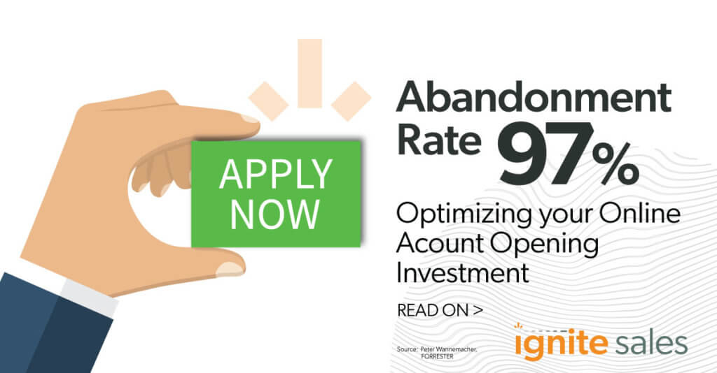
So, your customer finds a banking product or service they think might be a good fit for them on your bank’s website, but they are not sure. They have read the information that is available, and the next step is to complete an application. And there it is on the website product page: the naked “Apply” button, your customer’s start into an unknown process to get to an unknown result. The uncertainty and inhibitions about starting and completing the application process lead applicants to abandon the process about 90% of the time. How can this be fixed?
It is often said that this “customer journey” begins at the “apply” button, and OAO vendors spend a great amount of time and effort to create a “frictionless customer experience” after the button is pushed. However, the customer journey actually starts at the moment of customer engagement long before the customer gets to the apply button. In order to overcome the challenges of achieving great OAO performance, the customer must be engaged from the moment of interest to the point of application in a way that makes them feel confident and secure they are making the right decision and provides the level of enthusiasm needed to complete the application process.
Addressing Common Challenges
Here are the secrets to overcoming the four most common challenges to achieving great OAO performance:
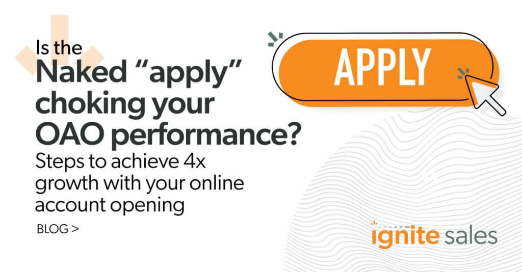
1) Turn the “naked” Apply button into a desired destination
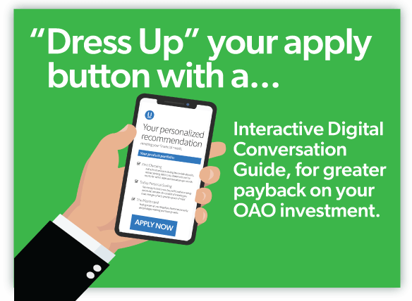
What in the world could make a customer excited and unafraid to get to the point in their buying journey where they actively seek out the “apply” button and want to start the application process with positivity and excitement? The secret here is to fully discover and understand the customer’s needs and circumstances so that highly accurate recommendations can be made to meet the customer’s specific needs with confidence and without fear. Then, provide information to the customer through information buttons or readouts about why the recommendations best meet their discovered needs. This will provide the customer with the necessary information they need to feel confident in hitting that “apply” button which is no longer “Naked” but dressed up and ready for the customer.
2) Use AI to overcome the “Matrix” effect
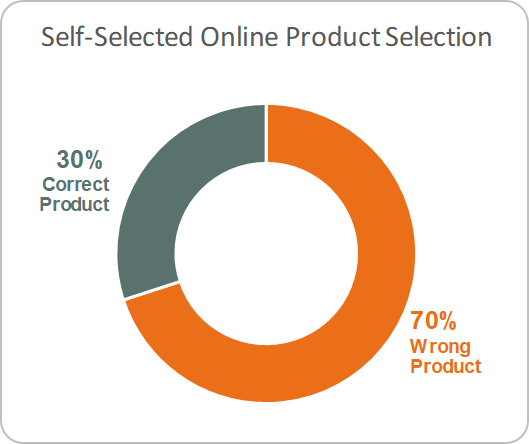
One of the most common online challenges is helping customers choose the “right product(s)” for their needs. Today, banking products are often displayed on the bank website in a “matrix” format that lists all the different products, their attributes, thresholds, and rules. The customer must then make the right product decision and click “apply”. This is where the friction becomes a real problem. Confronted with a product matrix full of choices, you can expect customers to be thinking, “should I choose this one, or this one, but wait–what about this one?” It’s great that banks offer so many products to meet the needs of so many different types of customers with different circumstances. This is the way it should be! But without guidance, customers can become frustrated or confused and give up the process altogether.
The secret to addressing this challenge is using dynamic conversation guides powered by well-designed, expert AI systems which help the customer zero-in very quickly on the best product(s) for them. When done effectively, guided conversations can increase the probability of online customers purchasing a product by 4 times. These digitally-guided conversations need to be dynamic, engaging and developed to be consistent with the design and culture of the overall website. Keep in mind that we are not talking about simple account selectors or next best product systems, which are both too simple and inaccurate to effectively understand the needs of customers and make highly targeted recommendations. Putting a conversation guide in front of the “naked” apply button makes for a smooth, frictionless, and engaging process before the “apply” button is clicked.
“Instead of making you weed through content, a conversation guide picks a tailored set of products for you. Because of that we have seen a tremendous lift and increase in digital sales.”
–Andy Hernandez, Regions Bank in American Banker ‘A digital leaders guide to building relationships’
3) Overcome the fear of rejection by increasing the rigor around qualification
The fear of rejection is a powerful demotivator that contributes greatly to the over 90% abandonment rate. Here again, providing a dynamic guided conversation producing accurate recommendations on the front end of the application process can greatly improve the probability that customers who hit the “apply” button will be well-qualified for the products that are recommended for them. Statistics from Ignite’s IQ Analytics database show that customers that go through guided conversations and product recommendations prior to the application process are 50% more likely to complete the application and 5x more qualified, thus raising the funding rate considerably.
“We found customers are 4x more likely to purchase from us when a conversation guide is used.”
–Andy Hernandez, Regions Bank in American Banker ‘A digital leaders guide to building relationships’
4) Create a frictionless customer journey starting at the point of engagement
The customer journey starts the moment the customer lands on the bank’s website. A frictionless customer journey should make it easy to find the right product while seamlessly going through the application process with minimal clicks, data entry and redundancy. So, what are the keys to this frictionless customer journey? When designing dynamic conversation guides, the details mean everything. Here are some keys to designing a frictionless customer journey:
- Make it easy to access digital guidance on the website. The more links to conversation guides, the less time the customer spends looking for helpful resources and the faster they can get to the “apply” button. Best practices suggest adding guidance buttons throughout the website with labels such as “Guide Me” or “Help Me Decide.”
- The design of the digital conversation guides that results in highly accurate product recommendations should incorporate easy-to-use interactive choice buttons that require a minimum of data entry. The best designs can be done with virtually no data entry in the guided conversations, pulling in customer information as needed, which minimizes starts and stops for the customer to look up information. Prefilling required data fields in both the conversation guides and applications are proven to improve the throughput of applications by 3x. More swipe, less type.
- Above all, the frictionless customer journey needs to be engaging and pleasing to the eye. Friction can take the form of inconsistent and inconvenient design elements, which can be off-putting, thus reducing the chances of the customer even getting to the “apply” button. Starting the customer journey with a well-designed guided conversation before reaching the “apply” button decreases the cost of acquisition, increases throughput, and generates follow-up opportunities.
Results of adding a journey before the “naked” Apply
*A large regional bank had an online account opening drop-out rate of 80%. After adding guided conversations, the application completion rate went up by more than 50%. Applicants knew what they were applying for, which gave them more confidence to complete the application. Schedule a chat to see what elevated customer engagement could do for your financial institution.
Read Part 1 click here.